ABSTRACT
Data visualization is the graphical representation of information and data. By using visual elements like charts, graphs, and maps, data visualization tools provide an accessible way to see and understand trends, out1liers, and patt2erns in data.
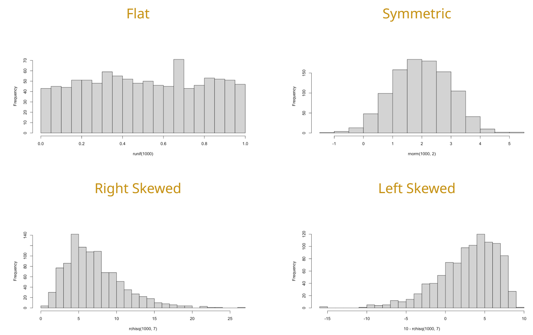
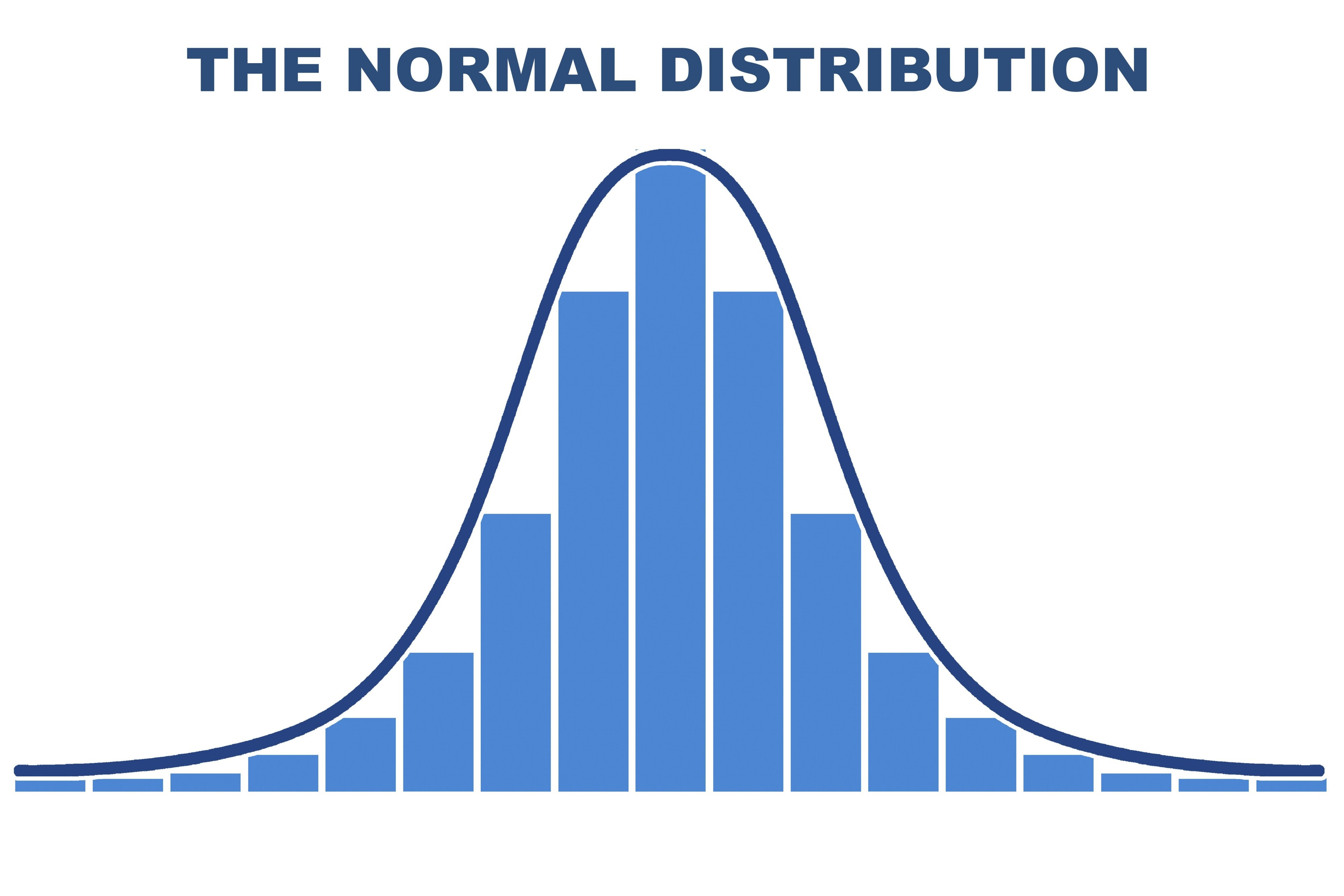
1. Describing the Shape
The shape of a dataset describes the distribution of data points across its range. Identifying the shape is the first step in determining which statistical tests are appropriate to use.
Skewness
Skewness measures the asymmetry of the probability distribution.
- Symmetric (Normal): The left and right sides are mirror images. The mean, median, and mode are all at the center.
- Right-Skewed (Positive): The “tail” of the data pulls to the right. The mean is typically greater than the median.
- Left-Skewed (Negative): The “tail” of the data pulls to the left. The mean is typically less than the median.
Kurtosis
Kurtosis describes the “tailedness” of the distribution, or how sharp the central peak is.
- Leptokurtic: High peak, heavy tails (more outliers).
- Platykurtic: Flat peak, thin tails (fewer outliers).
- Mesokurtic: Identical to a normal distribution.
2. Common Visualization Tools
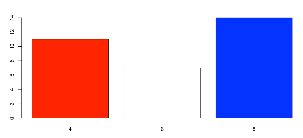
Bar Chart
- Best Use Case:
- Categorical
- Ordinal
- Discrete
- Key Insight: Shows the number of occurrences or frequencies for specific categories.
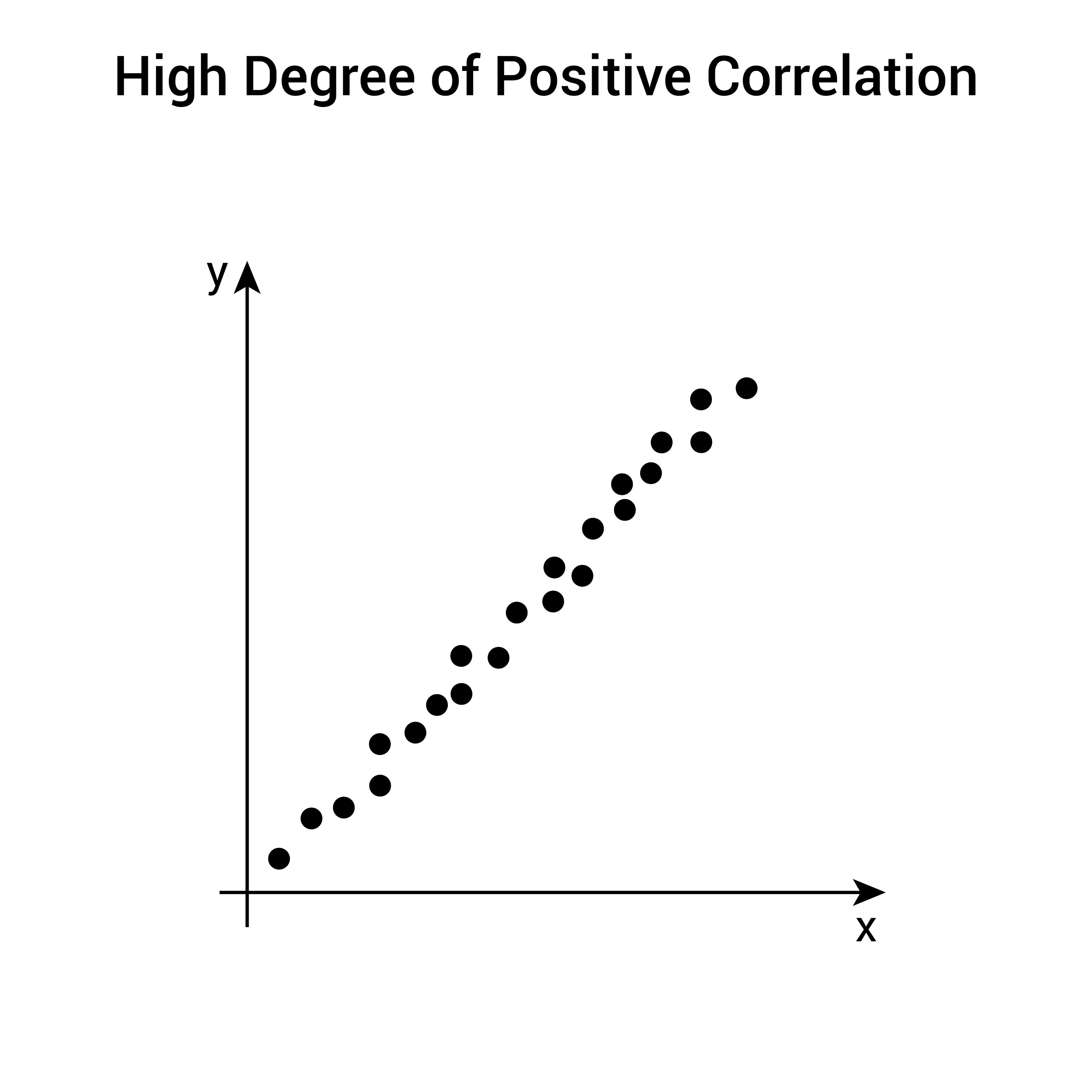
Scatter Plot
- Best Use Case:
- Continuous
- Key Insight: Shows the relationship or correlation between an Explanatory and a Response variable.
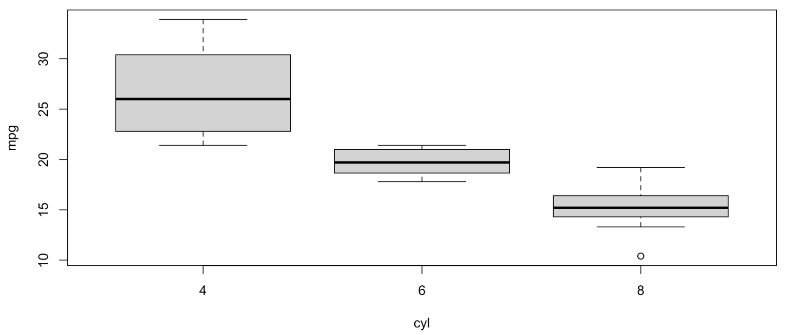
Box Plot
- Best Use Case:
- Numerical
- Comparing Multiple Groups
- Key Insight: Shows the five-number summary (Min, Q1, Median, Q3, Max) and identifies outliers.
Histogram
- Best Use Case:
- Numerical
- Continuous
- Key Insight: Shows the distribution and shape of a dataset by grouping values into “bins.”
3. The Relationship Between Variables
When visualizing data with two variables, we look for patterns that define how they interact.
- Linear Relationship: Points follow a straight line.
- Curvilinear Relationship: Points follow a curved path (e.g., exponential or quadratic).
- No Relationship: Points appear as a random “cloud,” suggesting the explanatory variable does not affect the response variable.
4. Best Practices
- Choose the Right Scale: Ensure the y-axis does not distort the data (e.g., starting at a non-zero value can exaggerate small differences).
- Label Everything: Include clear titles, axis labels (with units), and legends.
- Minimize “Chart Junk”: Avoid unnecessary 3D effects or busy backgrounds that distract from the data itself.